
We eat with our eyes first. Then, we proceed with our expectations. Finally, we taste. Yet the story rarely ends on the tongue. It continues across color, shape, arrangement, and subtle visual cues. Therefore, we must ask a bigger question. How much does plate design psychology steer flavor, satisfaction, and memory?
In this investigation, we will explore the visual stage. We will examine color, shape, and presentation. Moreover, we will connect these elements to perception, appetite, and enjoyment. Along the way, we will stay witty yet semi-formal. We will keep sentences crisp and active. Most importantly, we will keep your diner’s brain firmly in the spotlight.
Why Presentation Changes Perception
Food rarely arrives neutral. Instead, it carries visual meaning. It signals freshness, richness, balance, and care. Because of that, diners begin tasting before the first bite. Plate design psychology shows that vision primes the palate. Notably, a clean layout can suggest precision and quality. Meanwhile, a crowded layout can feel chaotic and heavy.
Furthermore, expectations color the experience. A beautiful dish seems more flavorful. A messy plate can make flavors feel muddled. Consequently, chefs design plates as persuasive tools. They guide attention, frame contrasts, and create harmony and tension. Thus, presentation becomes a silent seasoning.
Color: The Fastest Flavor Cue
Color acts first. It reaches the brain before aroma and texture. Because of this speed, color shapes perceived taste and appetite. With plate design psychology, specific hues influence emotion and judgment.
White Plates and Clean Perception
White plates feel neutral and bright. Consequently, they amplify contrast and freshness. Red berries pop. Green herbs look vivid. Sauces seem glossy and refined. In turn, flavors can appear more distinct and balanced. However, too much white space can feel clinical. Therefore, balance matters.
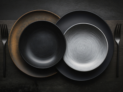
Black Plates and Intensity
Black plates suggest luxury and depth. Rich desserts look denser and more indulgent. Meanwhile, savory caramelization appears stronger. Yet black can mute pale foods. It can dull visual warmth. So, we should pair black plates with bold colors and textures.
Warm Hues and Comfort Signals
Warm colors evoke comfort and energy. Cream, tan, and soft gold feel inviting. They suit roasted dishes, autumn produce, and buttery sauces. Moreover, warm plates can enhance perceived sweetness and roundness. Still, they may reduce perceived acidity. Thus, balance acidity with green elements or bright garnishes.
Cool Hues and Freshness
Cool colors suggest clarity and freshness. Blues, cool grays, and sage greens fit seafood, salads, and citrus. They cue crispness and lift. Additionally, they pair well with high-acid dishes. Yet overly cool tones can feel distant. Therefore, add warmer accents for emotional warmth.
Saturation and Appetite
Highly saturated colors grab attention. They amplify perceived flavor. However, they can also overwhelm. Softer saturation feels elegant and balanced. With plate design psychology, use saturation to guide emphasis. Highlight the hero component. Soften the supporting elements. Consequently, the plate reads like a composed sentence.
Shape: Geometry Sets Expectation
Shape directs movement and meaning. It guides the eye. It organizes the bite journey. Moreover, shape anchors symbolism and emotion.
Round Plates and Harmony
Round plates feel organic and complete. They suit balanced compositions and circular arrangements. Additionally, round shapes encourage central focus. They can suggest comfort, community, and continuity. For shared meals, roundness feels natural and welcoming.
Square Plates and Modern Clarity
Square plates imply control and modernity. They favor grid-like arrangements and clean lines. Consequently, they support minimalist plating. They also emphasize negative space. As a result, each element looks intentional. However, overly angular layouts can feel rigid. Therefore, soften edges with curved components.
Ovals and Movement
Oval plates create flow and direction. They guide the eye along a path. They suit elongated proteins and linear garnishes. Moreover, ovals evoke elegance without severity. For tasting menus, ovals can suggest progression and story.
Bowls and Depth
Bowls introduce enclosure and warmth. They suit broths, grains, and layered textures. With bowls, diners expect depth and comfort. Additionally, bowls frame aroma more tightly. Thus, they heighten scent and anticipation.
Height and Structure
Height changes perception of value and complexity. Stacked components look crafted and thoughtful. Flat spreads feel rustic and casual. Meanwhile, mixed elevations create drama. Use height to signal sophistication or abundance. In plate design psychology, verticality can act as a flavor amplifier.
Composition: Where Taste Finds Focus
Composition defines the visual path. It sets pacing. It shapes the first impression and the final memory. Therefore, design becomes storytelling.
The Rule of Thirds for Food
Divide the plate into thirds. Place the hero element on a strong intersection. Then, support it with complementary sides and textures. Consequently, the eye lands on the right moment first. This approach builds clarity and anticipation.
Negative Space and Breathing Room
Empty space is not waste. Instead, it frames and emphasizes. It helps ingredients look cleaner and brighter. Moreover, negative space improves perceived balance and control. Use it to elevate importance and reduce visual clutter.
Color Blocking and Contrast
Group colors intentionally. Create contrasts that help flavors feel distinct. For instance, pair creamy neutral bases with sharp green notes. Or set ruby sauces against pale proteins. As a result, the plate reads clearly. The eater anticipates specific tastes.
Directional Garnishes and Eye Lines
Place herbs, sauces, or crumbs to guide the gaze. Point toward the primary bite. Frame the crucial texture. Consequently, diners focus where the flavor peaks. With plate design psychology, direction acts like a flavor map.
Texture and Gloss: Visual Mouthfeel
We also taste textures with our eyes. Gloss suggests juiciness and richness. Matte finishes feel modest and clean. Crispy elements sparkle under light. Creamy components look calm and smooth.
Therefore, contrast textures across the plate. Pair crackling shards with silkier purées. Combine juicy segments with crunchy crumbs. Moreover, align textures with expectations. A glossy steak reads succulent. A matte crust reads crisp. Consequently, the plate promises mouthfeel before the bite.
Portion and Balance: Satisfaction Starts Visually
Satisfaction relies on perceived fairness and control. Portion size communicates value and intent. Generous portions signal comfort. Smaller portions suggest precision and focus. Meanwhile, proportional balance reduces stress and confusion.
Arrange components so the eater understands the plan. Highlight a clear protein, vegetable, and starch strategy. Or emphasize plant-forward abundance with layered produce. Consequently, the diner feels oriented and calm. With plate design psychology, clarity enhances contentment.
Warmth, Height, and Distance: Spatial Cues Matter
Serving temperature connects with visual cues. Steam signals heat and freshness. Thick sauces suggest heft and comfort. Thin sauces suggest brightness and agility. Therefore, align visual thickness with flavor intent.
Additionally, consider the distance between elements. Tight clusters feel cozy and blended. Wider gaps feel composed and distinct. Moreover, varied spacing can indicate complexity. It invites sequential tasting. Consequently, the diner experiences a deliberate journey.
Symmetry vs. Asymmetry: Emotion in Balance
Symmetry feels stable and classical. It conveys order and tradition. Asymmetry feels dynamic and modern. It suggests movement and craft.
Choose based on your culinary narrative. For heritage dishes, symmetry can honor roots. For inventive plates, asymmetry can signal exploration. With plate design psychology, balance becomes emotional storytelling.
Cultural Context: Visual Meaning is Learned
Visual cues carry cultural layers. Red can suggest luck or spice, while white can indicate purity or emptiness. Square edges may feel formal or cold. Therefore, understand your diner’s cultural frame.
Moreover, match color and shape with the cuisine’s identity. Consider regional symbols and rituals. Align garnishes with familiar patterns. Consequently, the plate feels respectful and resonant. Relevance increases perceived flavor and satisfaction.
Lighting and Plate Material: The Stagecraft
Lighting changes everything. Warm light deepens golds and reds, whereas cool light lifts greens and blues. Soft light flatters textures. Harsh light magnifies flaws. Therefore, plate your dish to suit the setting.
Plate material also matters. Porcelain feels refined and neutral. Stoneware adds rustic gravitas. Matte finishes reduce glare. Glossy finishes increase drama. Additionally, textured plates create micro-contrast. They enhance the visual bite. With plate design psychology, the stage shapes the play.
Hospitality and Memory: Beyond the Bite
Presentation shapes memory. A plate can become a photograph in the mind. Therefore, plate design psychology extends beyond flavor. It reaches gratitude, occasion, and story.
When visuals match the culinary intent, trust increases. Diners feel respected and guided. Moreover, they recall the meal as coherent and generous. Consequently, they return with higher expectations and interest.
The Takeaway: Design Is a Flavor Multiplier
Taste starts with the eye, then follows the mind. As we have seen, color sets mood and expectation. Shape guides focus and movement. Presentation crafts story and memory. Therefore, design becomes integral to flavor and satisfaction.
With plate design psychology, you turn plating into persuasion. You guide anticipation toward delight. You deliver clarity, emotion, and balance. Moreover, you build trust in your craft. Consequently, diners enjoy more than taste. They enjoy meaning, harmony, and presence.
In the end, every plate tells a tale. Tell it with intention, color, shape, and space. Go ahead with confidence, and serve joy.